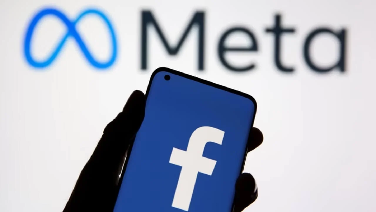
Meta, the parent company of the ubiquitous social media platform Facebook, has recently unveiled a fresh take on its logo. The intention behind this alteration is to craft a logo that is not only bolder but also exudes an electric and enduring appeal. In this article, we delve into the intricacies of this logo transformation and explore whether the changes are truly discernible to the average eye.
A Shift in Hue and Detail
The primary modification in the new Facebook logo comes in the form of a slightly darker shade of blue. While this alteration may seem subtle, it’s indicative of the company’s drive to present a more confident and polished image. Additionally, there have been some minor adjustments to the logo itself, particularly in terms of its lowercase “f.”
Enhanced Visibility and Contrast
One of the key considerations in the logo update was to enhance the visibility of the “f” within the app. The goal was to make it stand out more prominently, thus improving the overall user experience. These changes are not merely cosmetic but are aimed at optimizing the logo’s appearance.
Striking a Balance
Dave N, Director of Design at Facebook, elucidated the company’s vision for this logo refresh. It’s all about striking a balance between maintaining a sense of familiarity for its users while injecting a dynamic and elegant touch into the design. These nuanced adjustments seek to convey a sense of progress and evolution.
Three Key Drivers Behind the Change
Facebook identified three pivotal factors behind this logo evolution. Firstly, there’s the desire to elevate the brand’s most iconic elements, ensuring they remain at the forefront. Secondly, Meta aims to establish a more expansive color palette, rooted in the steadfastness of blue. Over time, Facebook’s logo has evolved from one with square boundaries to its present-day circular design.
Meet “Facebook Sans”
The new logo proudly employs the company’s custom typeface known as “Facebook Sans.” This custom typeface enhances overall legibility and fosters consistency in the visual identity. The wordmark and logo have undergone meticulous redesign to achieve these objectives.
A Broadened Color Spectrum
The fresh design initially led to some confusion among social media users. However, Facebook clarified that it has concurrently developed a new color palette. This palette incorporates various hues, tones, and contrast ratios. The inclusion of secondary blues with a broader tonal range allows for greater flexibility while maintaining a balanced representation of the brand identity.
A Glimpse into the Future
Facebook is not stopping at logo and color changes. The company announced plans for further refinements, encompassing reactions, typography, and iconography. All these enhancements aim to deliver a more coherent, personalized, and seamless experience for its extensive user base.
A Refreshed Identity System
Meta, the parent company of Facebook, hinted at even more changes on the horizon. The recent logo tweaks are described as the “first phase of a refreshed identity system” for the app. This suggests that users can anticipate further updates and enhancements in the days to come. The evolution of Facebook’s logo signifies not just a change in aesthetics but also a commitment to staying dynamic and relevant in the ever-evolving world of social media.
